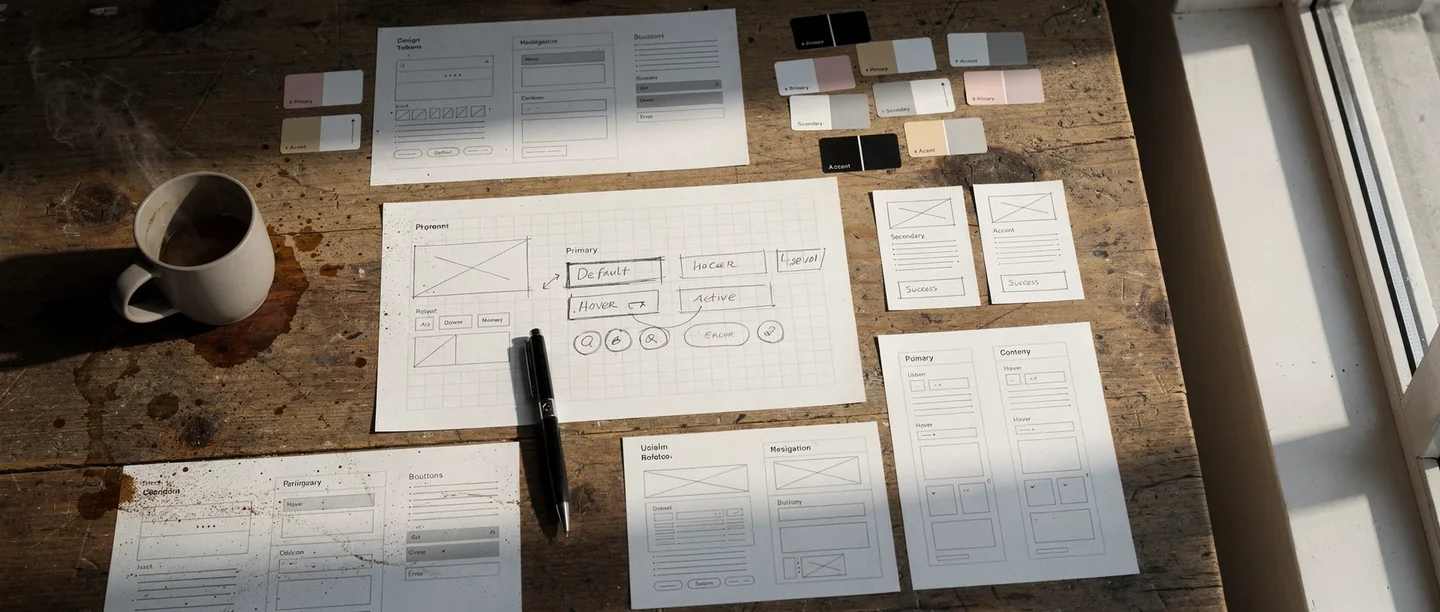
Design tokens: giving AI constraints that produce consistency
A design token is a standardized UI value stored as a named variable — a specific color, spacing unit, font size, border radius, or shadow. Instead of hardcoding #2563EB in fifty places, you define a token called color-primary and reference it everywhere. Material Design's token system is one well-known example of this approach.
Design tokens matter far more in AI-driven development than in traditional workflows. Here is why: without tokens, every time you ask AI to build a component, it picks colors, spacing, and typography from scratch. The results look fine in isolation but inconsistent side by side. One card has 16px padding, another has 24px. One button uses a 6px border radius, another uses 8px. The product feels cobbled together.
When you define a token set and include it in your project context, AI treats those tokens as constraints. Every component it generates references the same spacing scale, the same color palette, the same typography hierarchy. The result looks like one product, not a collection of separately designed screens.
I find this to be one of the highest-leverage investments you can make early in a project. The prompt example below shows this in practice — rather than specifying a token structure manually, you delegate the research to the AI. It finds current best practice for your business category, creates the token file, and applies it across the site in one step.
Once the tokens exist, every future component inherits that visual DNA automatically. For every subsequent UI request, instruct the AI to reference the tokens from your design system file without hardcoding any values.
If you reference design tokens in every UI request, maybe you should save this as a skill — a plain text file that the AI writes for itself, describing how to handle a recurring task. It reads that file next time it encounters the same situation. In this case, a file that loads your token constraints into every conversation where you build UI.
Cross-platform consistency through tokens
Tokens become even more valuable when you build across platforms. The same conceptual token — spacing-md or color-surface — can be expressed as CSS custom properties for web, XML resources for Android, and Swift constants for iOS. The visual language stays coherent even though the implementation differs completely. This is different from data consistency or content consistency. It is specifically about the visual layer: making sure a user who moves between your web dashboard and your mobile app feels like they are using the same product.

Build your design tokens
Research best practice for having a clean and elegant design 2026 appropriate for our type of business, and save this into a design system with design tokens, applied across the site. Follow the process.
You are not specifying the design — you are delegating the research to the AI. It finds current best practice for your business category, translates that into a concrete token set, and applies it everywhere in one step.
The "clean and simple" directive and why minimalism wins
When I ask AI to build or redesign a user interface, I almost always include the phrase "clean and simple." This sounds too basic to matter. It matters enormously.
LLMs tend to over-design when given free rein. Ask for a settings page and you may get nested tabs, accordion panels, toggle groups, info tooltips, and a sidebar. The AI is trying to be thorough. But thoroughness in UI design is the enemy of usability. Nielsen Norman Group's usability heuristics include "aesthetic and minimalist design" for exactly this reason — every extra element competes for attention and makes the interface harder to scan.
"Clean and simple" acts as a constraint that counters the AI's instinct to add. It produces interfaces with more whitespace, fewer controls per screen, and clearer visual hierarchy. The result is almost always better than the feature-rich alternative.
This extends beyond individual screens. When scoping a feature, I ask: what is the minimum UI that solves this problem? Not the minimum viable product in a business sense — the minimum interface that lets the user accomplish the task without confusion. Stripping back produces better experiences than building up.
In practice, the best approach is a user-perspective question rather than a directive — see the prompt example in the next section.
Progressive disclosure instead of feature density
The practical technique that supports minimalism is progressive disclosure — showing only what the user needs at each step, revealing complexity only when they ask for it. Advanced settings live behind an "Advanced" link. Bulk operations appear only after selecting multiple items. Error details expand on click rather than cluttering the default view.
You can direct AI toward this pattern explicitly by asking it to show the simple version by default and let users expand for details. This single instruction consistently produces cleaner results than trying to specify every layout decision.
Putting the LLM in the user's shoes
One of the most effective prompting techniques for UI quality is asking the AI to evaluate its own output from the user's perspective. After it generates a screen or flow, I ask whether it will be super easy for a new user to understand and whether they will get an optimal first impression — see the prompt example below.
This forces a shift in evaluation criteria. Without the prompt, the AI optimizes for technical completeness — does every feature have a control? With the prompt, it optimizes for usability — can someone figure this out in five seconds?
The answers are often revealing. The AI will identify its own labels as ambiguous, its own navigation as non-obvious, or its own error messages as too technical. It suggests simplifications it would not have made unprompted. The user-perspective question acts as a built-in UX review pass.
I also ground the AI to current design expectations. LLMs are trained on data that may be months or years old. Design conventions evolve. A pattern that felt modern in 2023 may look dated in 2026. Asking whether a user would get an optimal first impression nudges the AI to reference contemporary patterns — current Material Design conventions, recent trends in mobile navigation, modern form design — rather than defaulting to whatever was common in its training data.
Both techniques work because they give the AI a concrete evaluation frame. Instead of generating output and moving on, it pauses to assess quality against a specific standard. That pause consistently improves the result.
If you run this evaluation after every major UI change, maybe you should save this as a skill — a UX review checklist that runs automatically when you finish a screen.

Check from the user's side
Consider the UX from the user's perspective. Are we making it super easy for the user? Will they get an optimal first impression?
Two questions that shift the AI from builder mode to evaluator mode. "Super easy" is not vague — it triggers a concrete scan for friction, unclear labels, and unnecessary steps. "First impression" focuses the AI on what the user actually sees first, not what feels logical to the person who built it.
Mapping user journeys to find what you are missing
The user-perspective prompt above checks a single screen from one viewpoint. But a product serves different types of people who arrive with different intents. A powerful extension is to make the AI examine your product from every user type's perspective systematically. Journey mapping works best before you build screens; the single-screen check from the previous section applies after each screen is built. Together they cover both the strategic and the tactical level.
Start by defining the main user journeys: user of type X comes to the service to do Y. A learning platform might have a curious browser, a committed student, a parent checking on progress, and a teacher assigning content. An e-commerce site might have a first-time visitor, a returning buyer, and a gift shopper. Each type approaches the product with different expectations and different friction points.
Once you have the types, identify which journey you believe is the most common — this is the one that must be frictionless above all others. Then ask the AI to write the complete step-by-step experience for each user type, probably in a separate document. For each journey, force two justifications: first, why this is the most user-friendly approach possible and whether each step will be self-evident for the user; second, why this approach is optimal for driving revenue and upsell for the business.
This dual justification is what makes the technique powerful. It forces the AI to examine the same product from the user's perspective and from the company's perspective simultaneously. Issues that a single-perspective review would miss — a checkout flow that is easy but leaves revenue on the table, or an upsell that maximizes revenue but confuses users — surface naturally when both lenses are applied.
During the process, ask probing questions to keep the evaluation honest: "Will this really be optimal for driving revenue?" "Will this be super easy for the main user type?" "Is it self-evident what to do at each step?" Each question is a perspective, and each perspective tightens the net that catches issues. The more angles you test, the less room for major problems to slip through.
This technique is not limited to UX — the same principle applies to architecture, operations, content, and any other domain where work can be evaluated from multiple angles. But for UX work specifically, it is one of the highest-leverage activities you can do early in a project, before building screens.
Define user journeys
Define the types of main user journeys for our service — different types of people who will approach it with different intents and needs. Explain which you believe will be the most common. For each journey, write a complete step-by-step walkthrough. Justify why each journey is the most user-friendly approach possible, and whether each step will be self-evident. Also justify why the approach is optimal for driving revenue and upsell.
This prompt forces the AI to examine your product from every user type's perspective AND from the business perspective simultaneously. It usually surfaces issues that single-perspective reviews miss entirely.
Visual hierarchy, feedback, and the details that signal quality
The difference between a prototype and a polished product is rarely in the features. It is in the details: loading states, error handling, empty states, transitions, and visual feedback.
When a user taps a button, does anything happen immediately? If the action takes two seconds, is there a spinner or progress indicator? When a list is empty, does the screen show a helpful message or just blank space? When an error occurs, does the message tell the user what to do next?
These details are easy to direct AI to implement. I ask for them explicitly as a checklist: add loading states for all async operations, show meaningful empty states, make sure error messages tell the user what to do rather than just what went wrong. This is a checklist, not a design skill. But users interpret these details as quality signals. A product that handles edge cases gracefully feels trustworthy. One that shows blank screens or cryptic errors feels fragile.
Visual hierarchy through typography and spacing
Another area where explicit direction helps is visual hierarchy — making it obvious what to look at first, second, and third. The techniques are simple: larger text draws attention, bolder weight signals importance, more spacing creates separation between groups.
When reviewing AI-generated interfaces, I check whether the hierarchy is clear at a glance. If everything looks equally important, the page has no hierarchy. I ask the AI to increase contrast between heading levels, add more vertical spacing between sections, or make the primary action button more prominent. These are small adjustments, but they transform a flat layout into one that guides the eye.
The goal is not pixel-perfect design. It is ensuring that users can scan the screen and understand what matters without reading every word.
After building any new page, I do a polish check: does every button have a loading state, does every list have a meaningful empty state, do error messages tell the user what to do next, and is the visual hierarchy clear at a glance. The user-perspective prompt in the previous section runs this same check in one question.
From prototype to polish: when craft becomes the focus
Earlier in this series, the emphasis was on outcome thinking over craft. Build the thing first. Make it work. Do not obsess over visual details while the architecture is still forming. That guidance stands.
But there is a next step. Once the system works reliably — once the backend is stable, the data flows correctly, and the core user journeys function end to end — the visual layer becomes the priority. Users cannot see your backend architecture. They can see your interface. And they form trust judgments in seconds based on how it looks and feels.
The transition from prototype to polish is not about starting over. It is about layering refinement onto what already works. One effective approach is dedicating specific sessions to UI polish: reviewing each screen for consistency, checking that tokens are applied correctly, verifying that every interaction has appropriate feedback, and ensuring the visual hierarchy guides users through each flow.
I treat this as a distinct phase in the project, not an ongoing concern. Build first, polish second.
A polish session follows the same checklist every time: go screen by screen, check that design tokens are applied consistently, verify visual hierarchy, confirm every interaction has loading and error feedback, and handle empty states. Maybe you should save this as a skill — a polish pass you can run on any screen or flow when the function is stable.
The reason is practical: if you polish too early, you waste effort on screens that will change. If you wait until the function is stable, every polish pass sticks.
The design token investment pays its highest dividend here. When tokens are in place, polishing is fast — you adjust the token values and every component updates simultaneously. Without tokens, polishing means hunting through every screen to find and fix inconsistencies one by one.
AI UX design thinking is not about becoming a designer. It is about giving AI the right constraints — tokens for consistency, "clean and simple" for minimalism, user-perspective prompts for usability, and current-year grounding for modern expectations — so that what it produces meets the standard your users expect.

Frequently asked questions
- What are design tokens and why do they matter for AI-built products?
- Design tokens are standardized UI values — colors, spacing, typography, border radii — stored as named variables. They matter especially in AI-driven development because without them, AI picks different visual values each time it generates a component, producing inconsistent interfaces. With tokens, every component references the same design language automatically.
- How do I get AI to produce cleaner, simpler interfaces?
- Include "clean and simple" as an explicit directive when asking AI to build or revise UI. This counters the AI's tendency to over-design by adding unnecessary controls and visual complexity. Combine it with instructions for progressive disclosure — showing only what the user needs at each step.
- When should I focus on UI polish versus building features?
- Build first, polish second. Focus on getting the system working reliably before investing in visual refinement. Once the core user journeys function end to end and the architecture is stable, dedicate specific sessions to UI consistency, design token application, and interaction feedback. Polish sticks when the underlying function is stable.
- How do I ensure AI-generated UI looks modern and not dated?
- Ask the AI to evaluate its output against current expectations: "Is this interface what users would expect in 2026?" This grounds the AI to contemporary design patterns rather than whatever was common in its training data. Combine this with a user-perspective prompt: "Will this be super easy for a new user to understand?"
- Do I need design skills to apply AI UX design thinking?
- No. The techniques described here are about giving AI the right constraints and evaluation criteria, not about doing visual design yourself. Defining tokens, requesting simplicity, and asking usability questions are process skills, not design skills. The AI handles the implementation; you set the standards.