
The Trained Eye You Do Not Have
A photographer looks at the world and sees light, shapes, and geometric compositions that are invisible to an untrained eye. A UX designer looks at an interface and sees visual hierarchy, spacing rhythm, cognitive load signals, and interaction affordances that most people simply cannot perceive.
This trained perception is what separates a professional designer from everyone else. It is why two people can look at the same settings page and one says 'this is fine' while the other immediately spots that the spacing is inconsistent, the visual hierarchy is flat, and the call-to-action is buried.
If you have never studied design or spent years critiquing interfaces, you almost certainly do not have this perception. Acknowledging that gap — honestly, without defensiveness — is the first and most important step. Because once you acknowledge it, you can compensate for it.

The Techie Trap: Knowing Where to Click
There is a second form of UX blindness that is even harder to detect, because it comes with a built-in lack of self-awareness. It is particularly common among technical people.
If you built the system — or if you understand how it works — you know exactly where to click to make things happen. The navigation might be buried three levels deep, the button labels might be cryptic, the flow might require steps that no new user would guess. But none of that matters to you, because you already know the path. To you, it is easy. You click, it works, everything is fine.
The problem is that a regular user does not know what you know. What is obvious to you is invisible to them. And because the interface works perfectly for you, you have no discomfort signal — no feeling that something is wrong. You are blind to the disaster, and you do not even know you are blind.
This is why the questions matter so much. When you ask Claude 'Will a regular user understand what to do here?', you are compensating for a blindness you cannot feel. You are asking on behalf of someone who does not share your knowledge of the system. The most important learning for anyone technical: regular users will not understand what is evident and easy for you. Ask the questions anyway.
Claude Has Eyes — Use Them
Claude has visual analysis capability that approximates a trained UX eye. It can look at a screenshot of your interface and identify specific problems: inconsistent spacing, buried actions, unclear navigation, cluttered layouts, missing feedback states.
But here is the critical insight that many builders miss: Claude wrote your code but has not seen the rendered result. When you ask Claude to build a settings page, it generates HTML, CSS, and JavaScript based on its understanding of good UI patterns. It does not see what that code actually looks like in a browser. Sharing a screenshot is often an 'aha' moment — Claude can immediately see how the visual output differs from its intentions.
This creates a powerful feedback loop that did not exist before multimodal AI. You build, you screenshot, you share, and Claude evaluates with perception you do not have.
The Four-Step Feedback Workflow
The screenshot feedback loop is a simple, repeatable workflow:
1. Build. Have Claude generate or modify the UI. Do not worry about getting it perfect on the first pass.
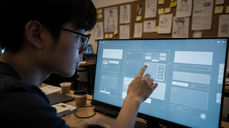
2. Screenshot. Open the result in your browser or device, take a screenshot of what you see, and paste it into the conversation.
3. React. Share your honest reaction as a first-time user would. You do not need to diagnose the problem. Just say what you feel: 'I find this view confusing.' 'Something feels off but I cannot say what.' 'Can this be made cleaner and more elegant?'
4. Iterate. Ask goal-oriented questions that guide Claude's evaluation toward what matters for your product. Then let Claude propose specific changes and repeat from step 1.
The magic is in step 3. Your discomfort is the signal. You do not need to know why something feels wrong — you just need to report that it does.

Express discomfort
I find this view confusing. Can this be made cleaner and more elegant?
You do not need to diagnose the problem. Share the screenshot and your honest reaction — Claude fills in the analysis.
The Right Questions to Ask
The questions you ask after sharing a screenshot determine the quality of Claude's feedback. Goal-oriented questions produce better results than technical questions because they force evaluation against what actually matters.
Questions that work well:
- 'Will a new user understand what to do here?'
- 'Will this UI help maximize conversions?'
- 'Are we really showing the most important things here?'
- 'Can we make this cleaner and more elegant?'
- 'Will our type of users intuitively know what to do here?'
Notice the pattern: every question is about goals and outcomes, not about CSS properties or layout techniques. You are doing what only you can do — defining what success looks like. Claude does the visual analysis to get there.

Goal-oriented evaluation
Will a new user understand what to do here? Are we showing the most important things? Will this help maximize conversions?
Goal-oriented questions trigger honest evaluation. Claude will often admit that its own output falls short and propose specific improvements.
Your Job in the Loop
The division of labor in the screenshot feedback loop is clear:
You provide: Goals and targets for the product. Hard questions from a business perspective. Honest expression of any discomfort you feel when using the interface. Context about your users and what they need.
Claude provides: Visual perception and analysis. Specific diagnoses of design problems. Concrete improvement suggestions. Knowledge of UX best practices and modern design patterns.
By delivering what is your responsibility — voicing goals, asking the hard questions, expressing dissonance — you give Claude everything it needs for an iterative process toward an excellent UI. You do not need formal UX training. You need the honesty to say 'this does not feel right' and the discipline to keep asking until it does.

Did you know?
-
In Nielsen and Molich's 1990 heuristic evaluation study, individual non-expert evaluators found only 35% of usability issues — while groups of five found roughly 75%. The gap exists because untrained reviewers systematically overlook problems in interfaces they already understand.
Nielsen & Molich (1990) — Heuristic evaluation of user interfaces, CHI '90
Frequently asked questions
- Do I need design experience to use the screenshot feedback loop?
- No. The entire point is that Claude provides the trained visual perception you lack. Your job is to share screenshots, express your honest reactions, and ask goal-oriented questions about what the UI should achieve.
- How many iterations does it usually take?
- Typically two to four rounds of screenshot-feedback-fix produce a significantly better result. The first round often catches the biggest issues. Subsequent rounds refine spacing, hierarchy, and polish.
- What if I cannot tell whether the result is good enough?
- Ask Claude directly: 'Is this clean and elegant by current design standards? What would a professional UX designer change?' Claude will give you an honest assessment, often identifying issues it introduced in earlier iterations.
- Does this work for mobile interfaces too?
- Yes. Screenshot your phone screen or emulator and paste it. Mobile UX has its own patterns — touch targets, thumb zones, scroll behavior — that Claude can evaluate visually just as well as desktop layouts.
- Why not just hire a designer instead?
- For established products with budget, a professional designer adds enormous value. The screenshot feedback loop is for builders who are moving fast, prototyping, or operating at a stage where hiring a designer is not yet practical.